


I’ve always heard it said that you can’t judge a book by its cover.
Apparently, it’s what’s on the inside that counts.
This is a nice sentiment, but when it comes to your website, the first thing people see will make a huge difference to how they interact with your site.
To get the highest possible conversion rate, you’ll need to experiment a bit with what works best for your brand.
A strong landing page:
- Draws in attention
- Tells users everything they need to know about your site
- Gives visitors information fast
- Encourages conversion
- Keeps things simple and concise
It’s not always easy to know what your site visitors are going to want to see, which is why constant A/B testing makes a big difference.
To help figure out what your site needs, I’ve compiled a list of my favorite landing page strategies for increasing conversion rates.
These are backed up by real-world examples with data and statistics proving their effectiveness.
Have a look through, and see how you could make a big difference to your landing page:
Strategy #1: Remove Navigation Links
One of the simplest ways to improve your landing page conversion rates is simply to remove all links from the page.
Faced with a distraction-free screen, site visitors find it easier to pay attention to what your landing screen is showing them.
Several sites have seen a rise in landing page conversion rates from removing navigation links:
- Yuppiechef increased their conversion rate from 3% to 6% just by removing navigation.
- Minders saw an increase from 2% to 17.6% by doing the same thing.
The Hubspot Experiment
To prove the effectiveness of removing navigation links, Hubspot A/B tested their landing page:
- One version contained navigation links in both the page’s header and footer, as well as featuring a bunch of social media share links
- The second version of the landing page didn’t have any links at all.
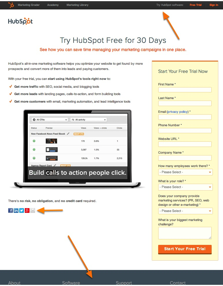
As a result of this, Hubspot saw an increase in conversion rates for all their download content.
Conversion Quality and Quantity
Hubspot looked at the effectiveness of landing pages which encouraged different kinds of behavior.
- Top-Of-The-Funnel (TOFU) resources, like free templates, are designed to hook new visitors.
- Middle-Of-The-Funnel (MOFU) landing pages, pointed visitors to product demos and sales team contacts.
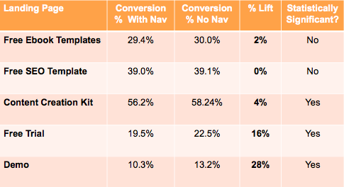
Different types of content saw different increases:
- TOFU landing pages saw a 0-4% improvement, which, while small, can still make a difference based on the site’s audience size
- MOFU pages saw a huge increase in conversion – between 16% and 28%.
Considering that MOFU conversions represent potential customers who are closer to making a purchase, this reflects a big improvement in the effectiveness of the landing page.
Removing distracting links is therefore not just better for increasing conversions, but also for increasing the quality of those conversions.
Strategy #2: Provide a Clear Call to Action
Humans are a lazy bunch.
It can take a bit of effort to convince a lot of site visitors to do what you want them to.
For this reason, I’ve found that a simple call to action makes a big difference to visitor behavior.
Make it Big, Make it Bold
The data definitely supports giving site visitors a big, encouraging call to action.
Nature Air A/B tested their landing page – the page was initially fairly cluttered, and lacked a strong call to action.
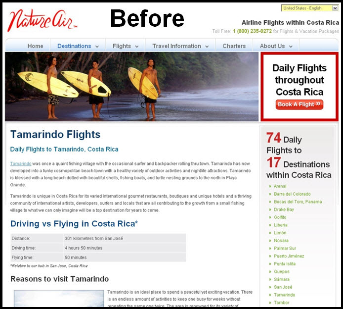
Along with several other changes, the company tested adding a big, friendly call to action button with red text that encouraged visitors to immediately buy flights.

This landing page saw a phenomenal increase in conversions – rates increased by 591% just by adding this simple box.
Punchy Text Pushes People
A big difference can even be made with just a small change to a landing page’s text.
Specifically, the more action-oriented the landing page’s copy is, the more visitors will feel encouraged to engage with it.
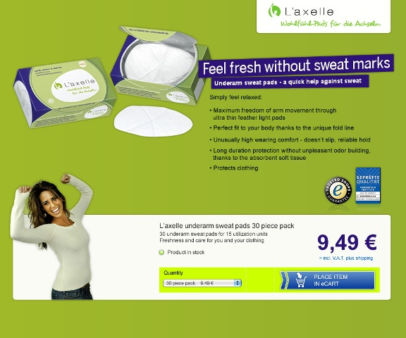
Sweat pad company L’axelle made a relatively small change in their landing page text when A/B testing its effectiveness:
- The old page read ‘Feel fresh without sweat marks’
- The new page read ‘Put an end to sweat marks’.
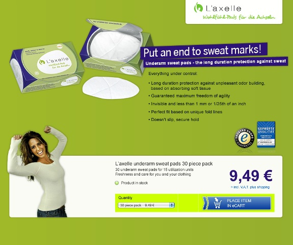
By encouraging visitors with more action-oriented language, the new landing page saw a 93% increase in conversions, to 38.3% of all traffic.
This shows just how effective a strong call to action can be to increasing a landing page’s conversion rate.
Strategy #3: Use Clear, Simple Imagery
Those who know me well are probably already aware of just how much I care about the importance of imagery in online marketing.
One thing I can’t stress enough: powerful images and videos make all the difference to any online campaign.
In the world of landing pages, where an image is the first thing site visitors see, it’s particularly important to get things right.
Visitors will make a huge judgement call about your site based entirely on what the first image they see looks like.
Hawk Host proved the effectiveness of an appropriate image when A/B testing their landing page.
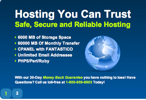
The original landing page featured simple, bold text that outlined some of the benefits of the service, along with a picture of a globe, indicating the site’s global nature.
As all websites are global, this wasn’t exactly the strongest image that the site could have used.
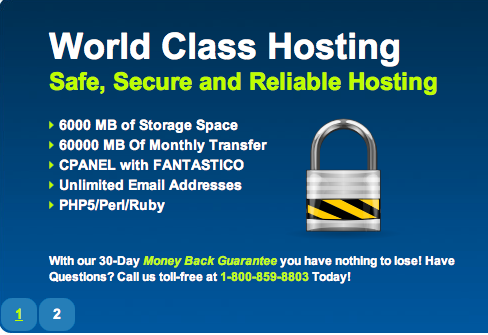
After testing a variety of different images, the one which proved most successful was a padlock.
For a company delivering web hosting an online storage services, it makes sense that the message visitors like to see emphasized is the site’s security.
The padlock image worked on average 2-3x better than the image of the globe, showing just how much difference the right image can make to your landing page.
Strategy #4: Feature Glowing Customer Quotes
The visitors to your site are naturally going to be a bit skeptical.
I mean, of course you’re going to tell them your services are fantastic. Why should they take your word for it?
That’s why featuring a strong reference from a customer can make a huge difference to your page.
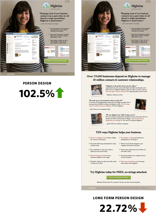
Highrise marketing was able to increase their conversion rate by 102.5% by prominently featuring a picture of a smiling woman with a customer quote next to her.
This emphasized the satisfaction that other customers had with their products.

Further, Highrise found that adding a substantial amount of longform text after the customer review led to a big drop in conversions.
Apparently, the best tool for showing the benefits of their service was a simple, glowing report from an existing customer.
Wondering whether the key ingredient was the particular customer photo they’d used, Highrise went on the A/B test a variety of different customer photos and quote.
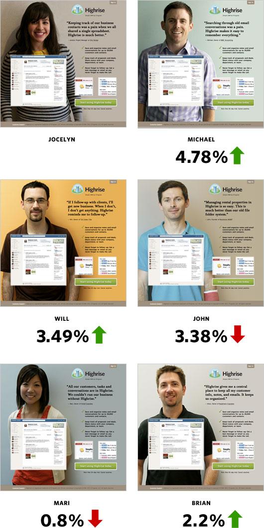
While some customer quotes increased conversion by almost 5% compared with their initial customer image, no one photo or quote stood out hugely.
From this, it’s clear that letting site visitors know just how happy your customers are with your services is a fantastic way to encourage further conversions.
Strategy #5: Change Your Color Scheme
I’ve already talked about the importance of a strong call to action, and how clear imagery can make a big difference to conversion rates.
Wouldn’t it be great if the colors on your landing page managed to give an implicit call to action as well?
Depending on what colors you pick, your landing page can to just that.
A leading UK airline British Midland International saw a 2.5% conversion increase when changing the color of their call to action text to red.
This shows just how important prominent coloring can be to conversions.
Red versus Green
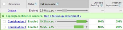
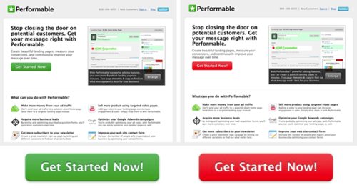
Performable (now owned by Hubspot) A/B tested their site with what seemed on the surface to be a really small change.
They changed the color of their action button from green (the color of the brand’s logo) to red.
Now, color theory is a complex issue, but generally people tend of think of colors as being related to traffic lights:
- Green means go – that means visitors will act, right?
- Red means stop – so a red button will stop visitors from clicking it?
In reality, though, the traffic light colors are chosen for different reasons.
Red and green have action-related associations:
- Green is a passive, calming color – the color of nature, which makes people feel more relaxed, which is useful when they’re accelerating in their car.
- Red is the color of fire, blood, and action – a red light is a call to immediate, non-delayed action, which is why red lights are used to mean stop.
(Of course, all of this is a moot point if you’re red/green colorblind, but that’s a color theory for another day…)
By changing their buttons from green to red, Performable saw a 21% increase in conversions – many more people were eager to click a red button than a green one.
If you’ve ever seen Men In Black, that’s hardly surprising…
Strategy #6: Be Upfront About Pricing
One thing that’s clear from a lot of the examples on this list is that visitors want to spend as little time on your landing page as possible.
They want clear, informative information, and if they don’t get it straight away, they won’t bother to stick around.
And if there’s one thing visitors are looking to get a quick understanding of, it’s price.
A Clear Price Tag
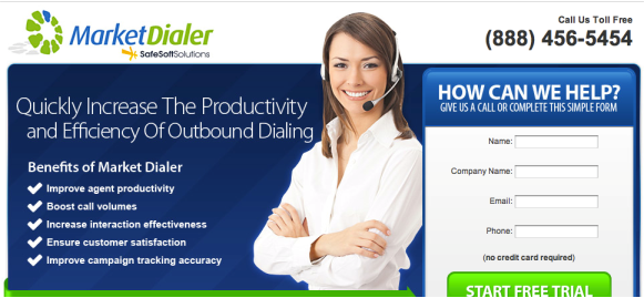
SafeSoft Solutions A/B tested the landing page for their Market Dialer product to see whether including a clear price tag would make a difference.
Their original landing page focused on their service’s qualities, but it didn’t give prospective customers any indication of the cost of their service.
The company tested this against a version of the landing page which had one slight change: it displayed the cost of Market Dialer in a clear, hard-to-miss green circle.
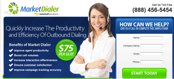
To SafeSoft’s surprise, being upfront about the cost of their product increased conversions by 100%.
Customers were a lot more interested in talking to the company about its services when they were already aware of how much it would cost.
What’s more, as these leads already knew what to expect in terms of price, they’d already begun to consider and plan for using SafeSoft’s service.
Ultimately, the leads were of a higher quality for being told upfront what they’d expect to pay.
Strategy #7: Trim the Fat
To be effective, a landing page needs to be direct and to the point.
Any repetition in text is going to slow down the speed at which visitors take in the information your landing page offers.
And, as visitors want to get to the point as soon as possible, if they feel your page is too cluttered, they won’t bother properly engaging with it.
Tidying Things Up
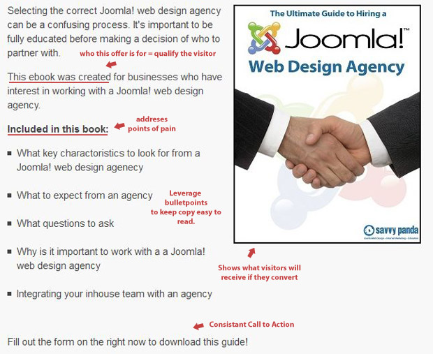
In order to streamline their landing page Savvy Panda analyzed their existing page and noted areas for improvement.
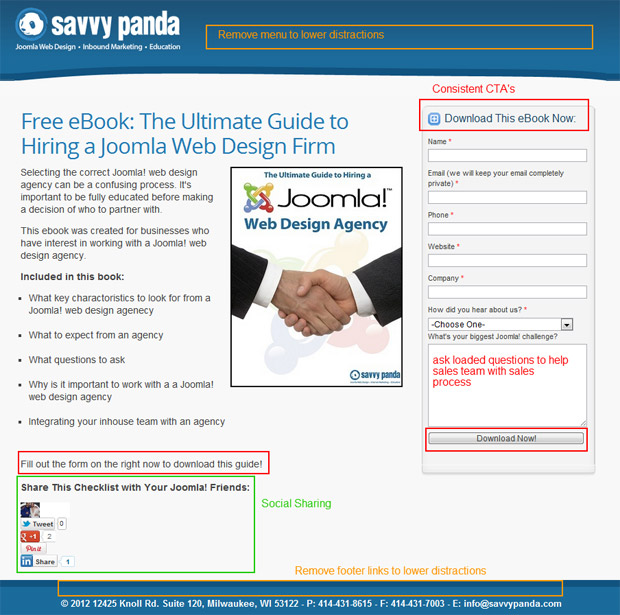
They found that:
- The call to download their free ebook was found in three places – not only was this unnecessary repetition, but it was confusing as it made it unclear where users needed to click to download the book.
- There was a lot of wasted empty space at the top and bottom of the landing page, which drew attention away from the important text.
- Social links were taking up a lot of space and distracted from the main goal of the page, which was to encourage ebook downloads.
Savvy Panda reworked their page to be more direct, simple and to-the-point.
For their trouble, they received a 30% increase in conversions.
This shows just how important it is to make sure that a landing page is free from distractions and clear about what visitors are expected to do.
Strategy #8: Be Thorough
While it’s important to be direct, that doesn’t necessarily mean that your landing page should be sparse.
You want to put as much information on it as possible, to make sure that customers get a full sales pitch and are aware of what you’re offering.
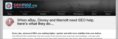
Moz (known as SEOmoz at the time) found when reworking their landing page that there just wasn’t enough space on a single page to give the full breakdown of everything their company offered.
Against popular marketing logic, they redesigned their landing page to feature huge amounts of content that visitors could scroll through, getting a better idea of what Moz had to offer.
It’s important to note that this content wasn’t repetitive or overly wordy – it was designed to be engaging, and to lead easily from one point to another, to keep the visitor’s attention.
In order to make the most of this very long landing page, Moz focused on providing quality content:
- They featured a video message to draw visitors in.
- They explained all levels of service that they offered.
- They focused on features that mattered to customers.
- They injected a little mystery into their headings to keep visitors interested.
All of these little touches meant that, while very long, Moz’s landing page was optimized to give visitors a solid understanding of the services they had to offer.
This paid off, as the new landing page had a 30% higher conversion rate than the old page.
Landing pages aren’t necessarily better when they don’t say a lot – what matters is letting your visitors know exactly what you’re offering.
If that takes more space, that’s not necessarily a bad thing.
Strategy #9: Give People What They Want
Any good fisherman knows that you’re got to use the right bait for each breed of fish.

Similarly, your landing page is only going to be of use if you’re targeting the right demographic.
You want to make sure that the visitors to your site are see a message that appeals to them, and draws them in.
The Sims Experiment
The good thing about A/B testing your landing page is you’re able to pinpoint exactly what your site visitors want to see.
That’s what happened when EA’s The Sims game tested their landing page.
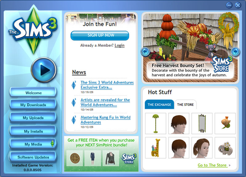
They were particularly focused on finding exactly what potential customers wanted to see – they tried a few different versions of the page which emphasized different selling points for the game.
In the end, the landing page which performed the best emphasized the free in-game perks that were on offer.
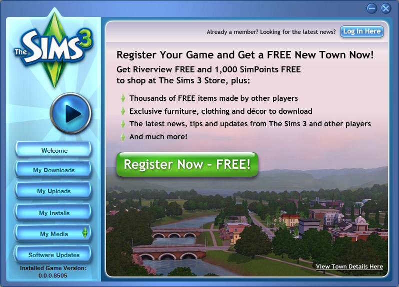
This landing page ended up generating 128% more new signups than the original page.
I’d say this shows pretty clearly the benefits of not assuming you know what elements of your product appeal most to site visitors.
Test widely to figure out exactly what your potential customers want to see.
Strategy #10: Arrange Content Carefully
Layout is key to drawing site visitors’ attentions.
While your landing page’s content might be perfect, its arrangement on the page can have a huge impact on how people respond to it.
While some studies have shown that content on the top part of the page gets 80% of user attention, sometimes it pays to put things lower down.

Content Verve, for example, found a 304% increase in conversions after moving their call to action button to the bottom of the page.
This meant that before site visitors were encouraged to act, they’d already read through the benefits of Content Verve’s services and knew what they were getting.
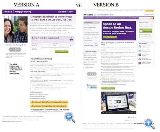
Similarly, Aussie Mortgage Broking found that arranging their landing page in fewer columns helped to funnel visitors into reading their pitch in the right order, which led to a 64% increase in conversions.
In my experience, a well-designed landing page:
- Takes readers on a carefully organized journey through the site’s sales pitch.
- Logically flows from one point to the next.
- Creates a compelling narrative that’s easy to follow.
- Holds off on a call to action until visitors are ready to make an informed choice.
It’s only through careful arrangement of your landing page that you can make the most of each site visitor, and make sure they learn about your brand in a logical, well-planned way.
Test, Test Test
There are a lot of tricks and techniques to crafting the perfect landing page.
The data that other projects have generated may not accurately reflect your own site, though – your audience, products and services are likely to require unique approaches in order to really shine.
For this reason, it’s important to constantly test and retest your landing page to make sure it’s as compelling, attractive and informative as possible.
After all, you want your company’s first impression to be the best that it can be.
Good luck, and happy testing.
Got another great landing page split test example to share? I’d love to hear from you. Leave a comment below sharing your experiences:
Images:
Book Cover, Hubspot, Nature Air, L’axelle, Hawk Host, Highrise, Performable, Red Button, SafeSoft, Savvy Panda, Moz, Tackle and Bait, The Sims, Content Verve, Aussie Mortgage Broking.
