


Research by MarketingSherpa revealed that 68% of B2B businesses use landing pages to generate leads.
Despite following industry guides on the best practices for high-converting pages, many businesses fail to get their desired results.
In fact, only the top 10% of landing pages have conversion rates of 11.45% or higher.
So where are the rest of these businesses going wrong with their landing pages?
Despite hours of trawling through reputable data and throwing money into paid campaigns, nothing seems to be working.
I’m going to be blunt with you… Sending traffic to a bad landing page is a bit like eating a bucket of fried chicken and then going to the gym.
Your efforts are going to have very minimal returns.
It can often be the case that the research findings you’re pinning your hopes on aren’t right for your specific industry. A combination of your own intuition and best marketing practices may generate better results.
Constant testing is critical, as even small changes to your landing page can lead to a leap in your conversion rates in unexpected ways.
But where do you start, if standard best practices have let you down? The following case studies contradict current marketing wisdom by testing with atypical strategies.
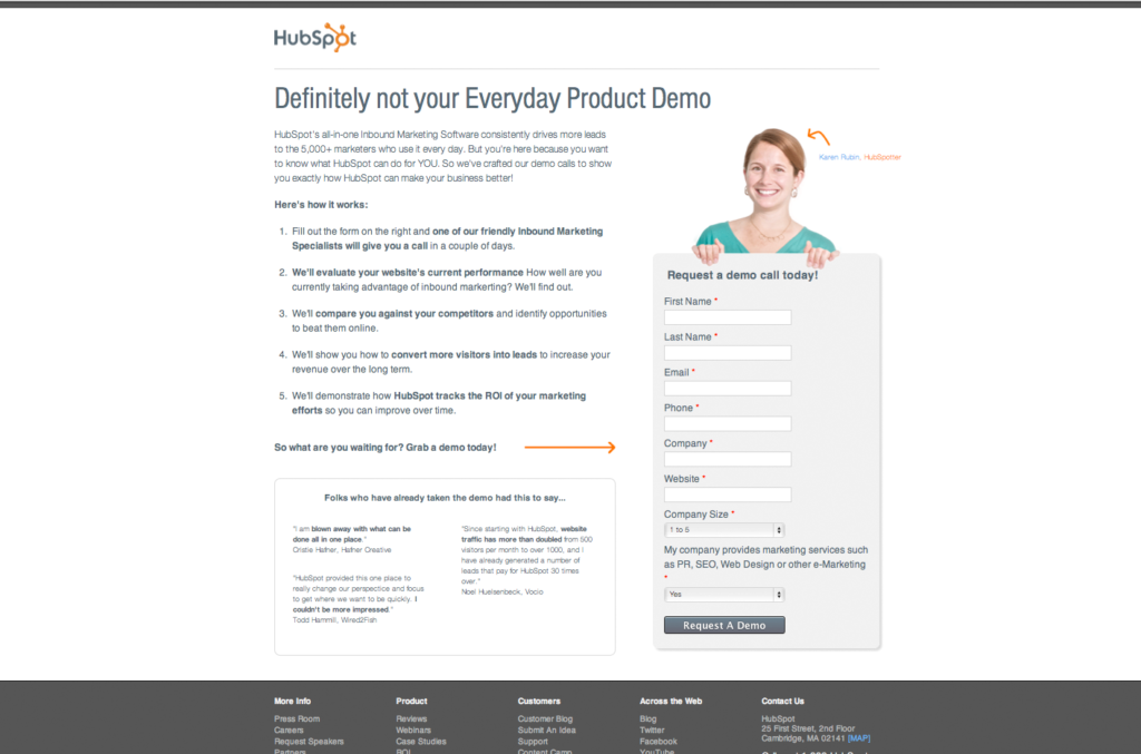
1. Make Your Forms Harder to Fill Out
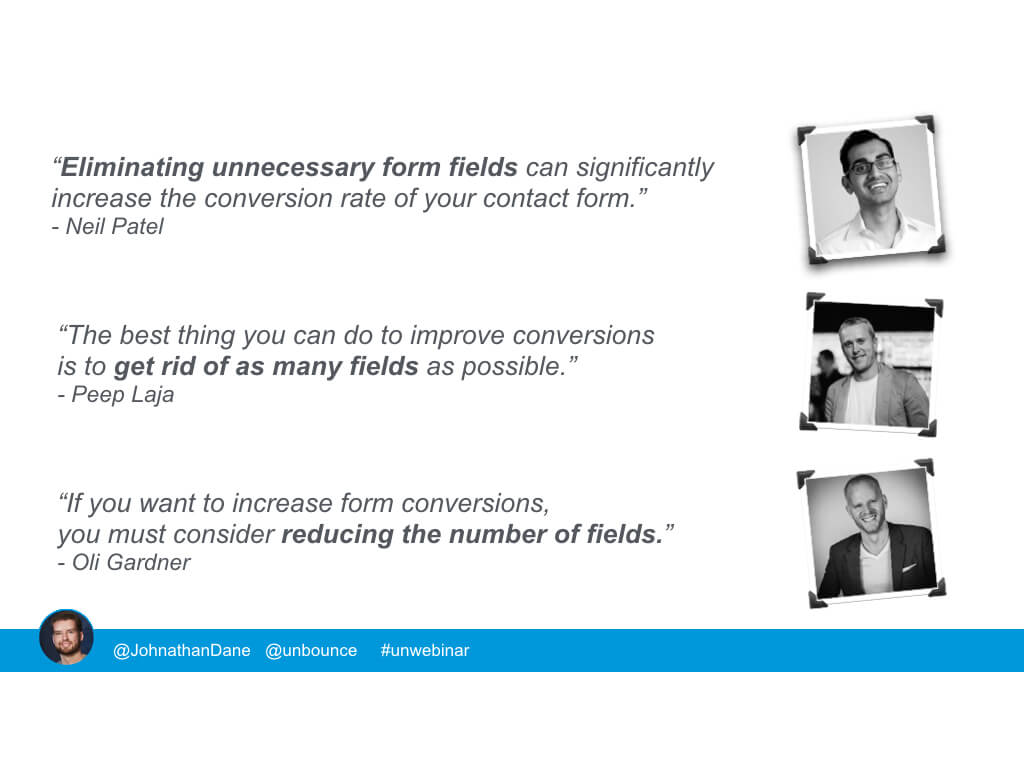
Three out of three content marketing experts agree that simplifying your form fields leads to greater conversions. But what if the gurus are wrong?
The contact form pictured below demanded a lengthy attention span from its visitors to populate nine fields before submitting.
The first move from the tester at Unbounce was obvious: trim the unnecessary fields to make the form simpler. It’s a formula that should guarantee success.
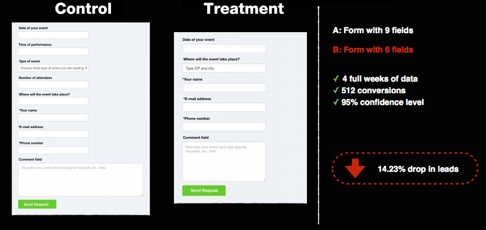
However, when the results came in, the simplified form showed a confusing 14.23% decrease in conversions.
The tester, reflecting on the unusual outcome of this test, stated that the result might be due to the fact he “removed all the fields that people actually want to interact with and only left the crappy ones they don’t want to interact with. Kinda stupid.”
There is a beneficial upside to having long forms on your landing page. The submissions they attract are likely to be high quality leads who are genuinely interested in what you have to offer – and who will gladly fill out a lengthy form to find out more.
Key Takeaway: While shorter forms may secure a larger amount of sign-ups, they may also be leads who won’t generate any sales over the long term.
2. Don’t Use Images
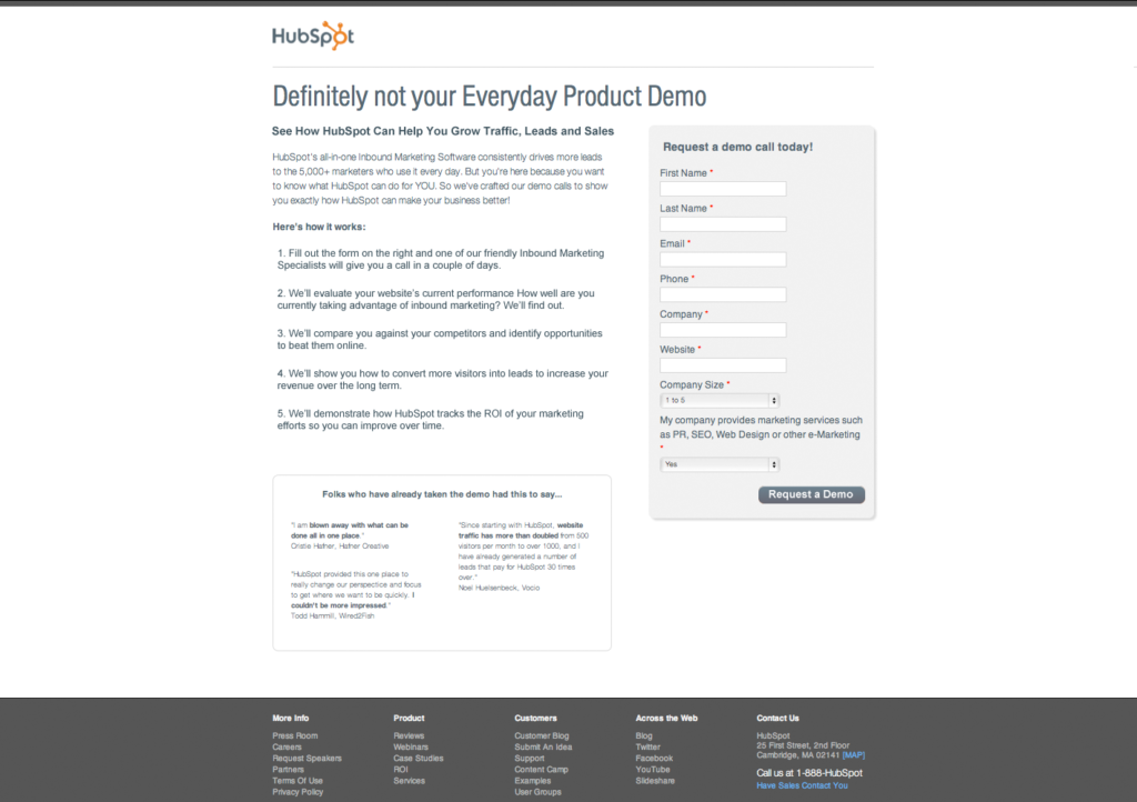
I’ve seen this result in my own landing page tests at Louder, but in this example, the team at HubSpot tested the two forms below for their landing page.
The only difference? The image on the lower form.
Setting the test up this way makes sense. The inclusion of an image is widely accepted as best practice in digital marketing, as it promotes trust in the viewer and an emotional connection with the smiling face on the screen.
It seemed obvious which test was going to win.
Control
Variation
When the results of the A/B testing came in, the 24% increase in lead generation on the form that had no image came as a shock.
The testers theorised that the use of their image complicated the landing page and pushed the form fields further down the screen.
They also felt the photo gave the impression of being a cheap stock image (in reality, it was an actual employee) that cheapened the look of their offer. It also wasn’t a particularly relevant image for the offer that was being presented.
Key Takeaway: If you’re using an image on your landing page, make sure it complements your product and doesn’t detract from your offer.
3. Remove the Call to Action Button
MetaGeek wanted to see if they could do even better with one of their high-traffic pages, on which customers can download software. They employed Joanna Wiebe of CopyHackers to put her expertise to work.
In the image below, you can see the original page with the call to action section on the left hand side in tiny, orange text.

It would seem painfully obvious, even to landing page newbies, that the use of brightly colored buttons would bring more attention to the offer and in turn provide an easy gain in conversions.
As a test, bright, visually-appealing CTA buttons were added. They clearly convey what they want the reader to do next and, unlike the variation with the small text, they’re hard to miss.
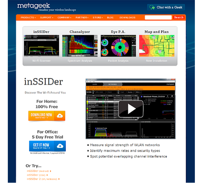
Several different button pages were tested, but every variant with a button saw conversion rates drop, at a staggering rate of 6% to 80%.
Contrary to everything marketing data would have us believe, the boring text option won by miles.
MetaGeek theorised that due to their customers being very experienced internet users, they might be at the point where they trust a text-based link more than colored buttons that can often be a cover for malware or spam-related deals.
Key Takeaway: Don’t assume buttons are in your site’s best interest. Make sure the data backs up their inclusion.
4. Place Your CTA Well Below the Fold
In a 2015 study, the Nielsen Group found that the 100 pixels above the fold are viewed 102% more than the 100 pixels below the fold.
The bulk of the current data backs this up, emphasising that a call to action should be clearly visible the instant you arrive at a landing page.
Due to the huge range of screen sizes and devices we view our content on, the exact placement of the CTA can vary.
With mobile browsing now accounting for more than 60%of digital minutes, it would seem to be a fundamental design error if your call to action isn’t placed as close to the top of the page as possible to ensure it shows above the fold on all device types.
This case study by Michael Aagaard proves that there’s still life below the fold. The call to action was moved right down the page so readers had to scroll to interact with the offer.
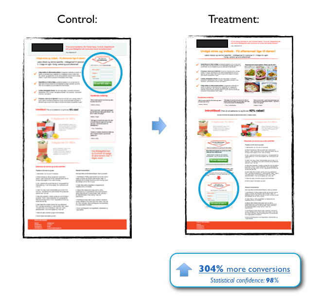
The result was a phenomenal 304% increase in conversion rates, debunking all the best practice advice to the contrary.
Aagaard hypothesised that there is a “correlation between the complexity of the product/offer and the optimal placement of the CTA.”
In this particular case, a call to action placed at the top of the page would have presented as being too ‘salesy’ without explaining the benefits to the customer before they made their decision on whether or not to take up the offer.
Key Takeaway: Customers are still humans. If your business has a more detailed product or service to present, setting out the necessary information for customers to digest instead of demanding they take immediate action can be a beneficial strategy.
5. Leave Out the Social Login Option
You may have noticed the trend in businesses offering a sign-up option on their sites using a third-party identifier such as Facebook.
This can save users a lot of time, as it often just takes one click to sign up for an offer instead of filling in multiple form fields.
Social sites already have already built trust with their users, making it seem like a no-brainer to add the option of a one-click login to capture those extra sign-ups.
Facebook captures around two-thirds of this social login market and there is abundant research to support the social login as a way of gathering more leads.
Enter, BliVakker, an online cosmetics store. They wanted to test a humble, single-form data field against a variant that included a Facebook login option.
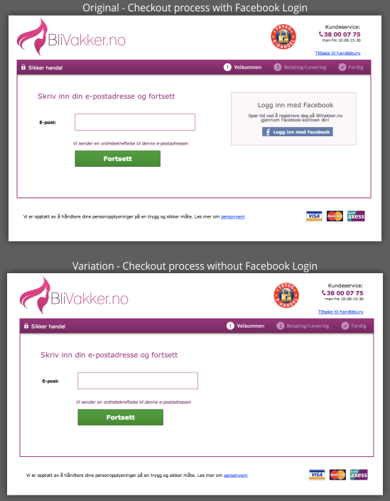
Surprisingly, the landing page without the Facebook login option saw a conversion increase of 3%. This may seem like an insignificant win, but with BliVakker’s daily website visitor count it translated to a healthy $10,000 in extra sales across a seven-day period.
The result of this test confirms that customers could still be averse to linking every online move they make to social media platforms. They don’t want to share their browsing habits and details any more than they have to.
Logging in via social sites such as Facebook could expose customers to unwanted targeted ads, plus they may inadvertently be showing friends and family what they have been purchasing online if the site does not explicitly state that details of purchases will not be shared to the social platform.
Key Takeaway: Universal logins may not mean as much to users as brands believe. Test variations using old-fashioned login credentials against their social counterparts.
6. Leave Social Proof Out of Your Opt-In Forms
We all love social proof statistics that demonstrate trust in a product or service, right?
We all like to know other people have blazed a trail before us, taken the risk on a product and found it to be excellent. Our minds are set at ease and this triggers us to make a purchase.
DIY Themes tested the below opt-in forms, and found the minimal variation in the center that contained no social proof statistics garnered a massive 102.2% increase in conversions
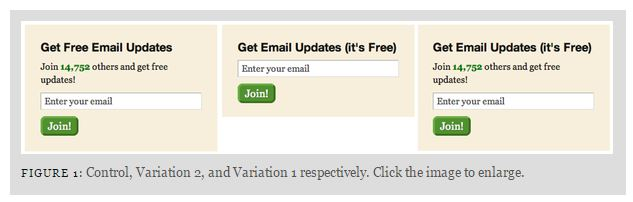
Social proof was – for some reason that defies all data to the contrary – killing their conversion rates.
As you can see from the graph below, both the test boxes with social proof numbers pretty much flatlined, while the second variant saw a healthy escalation in conversions over time.
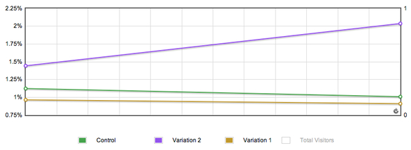
The new opt-in form only resulted in 1% more conversions overall, but when you have a large customer base in the hundreds of thousands, this small change can definitely pay off.
Tester Derek Halpern of Social Triggers concluded that the social proof tests may have failed because the numbers were placed above the email sign-up field, and the cluttered layout may have distracted customers.
Additionally, he felt the statistical amount may have given viewers a reason not to sign up, as the numbers were too low to present a compelling reason to accept the offer.
Key Takeaway: Don’t assume that social proof is a requirement. Test variations that both include and exclude this information and monitor their performance over time.
7. Make Your Offer Unclear and Confusing
Landing page best practices dictate that a customer should be aware of the following a few seconds after landing on your website:
- What your business does
- What you’re offering
- What you want them to do next
The team at Zapier tested with a bright, minimalist design where their offer is presented clearly, but where the user must scroll much further down the page to reach it.
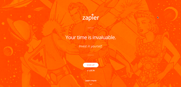
The immediate landing page reveals nothing about Zapier at all. Unless you already know exactly who Zapier is and what they do, it’s just a horrible orange disaster.
The page was heavily criticised in a User Testing post for including none of the elements expected to be included in a business landing page except for a mysterious call to action button.
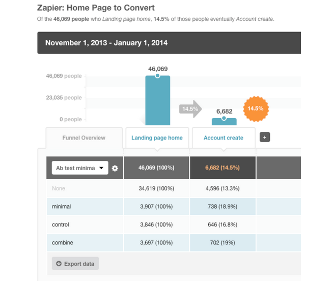
But Zapier let the data speak for itself, testing this control against some more standard page variants. The ugly duckling page was the overall winner by a good margin.
So why did this perplexing page convert better when it flouted every available design and content rule?
Visitors, piqued by their own curiosity, were more likely to interact with this offer after scrolling down to discover more.
If customers can be provoked to find information for themselves rather than being force-fed by a standard landing page, it can mean a big boost in conversion rates.
And, sometimes the ugly duckling just wins (as demonstrated by the highest performing vendor on ClickBank). If it leads to a significant percentage increase in sales, ugly can be beautiful.
Key Takeaway: Take a chance on ugly. Great design isn’t always the best solution when it comes to results.
8. Don’t Use Icons
You may have noticed that icons are trending at the moment, with the cute vector images improving both UX design and customer engagement.
Build.com wanted a slick looking landing page header with industry-appropriate icons designed to guide customers more easily through their product range.
They tested against a very plain version without the icons.
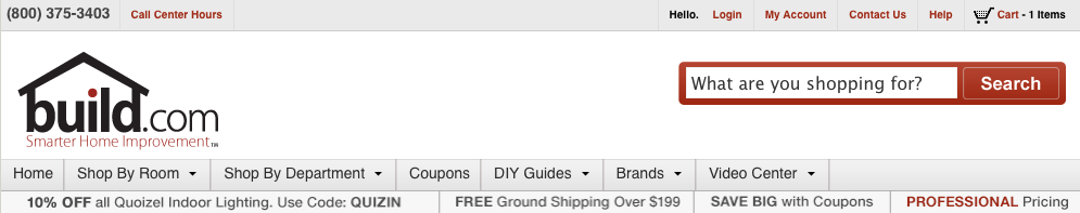
The popular vector images in the navigation pane lent an element of style and were visually appealing.
It was expected that by displaying their most popular product categories and providing a more seamless navigation experience, this variant would easily increase revenue.
Unfortunately, those nice little icons saw a 21% drop in product purchases for Build.com.
The testers in this case theorised that, although the icons provided a smoother navigation journey for visitors, they also had the negative effect of cluttering the page and being visually distracting. This could contribute to a buyer’s reluctance to make a purchase.
Key Takeaway: Don’t overcomplicate things that are working. Sometimes it’s clean, minimalist design that gets the job done best.
9. Remove the Social Sharing Buttons
Social share buttons make it easy to tell everyone about that cool kitten video you just watched. With a couple of clicks you can distribute this valuable information across multiple platforms to hundreds of people in mere seconds.
If your business goal is to reach a wider scope of people, your numbers game gets stronger with the addition of social sharing.
You get more potential eyes on your prize and if you have share counts enabled, it builds trust in your brand and triggers more people to purchase your products.
Everyone loves sharing and, psychologically, the power of social media should be on your side when you use it to boost your conversion rates, right?
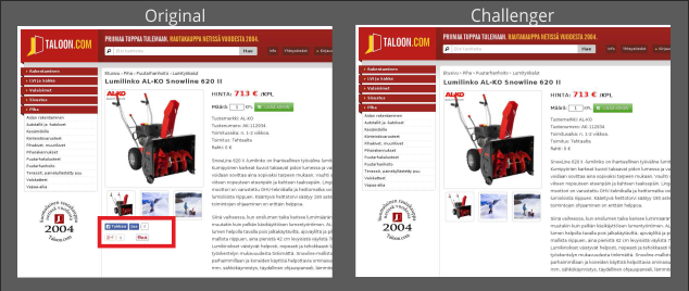
The results of this test proved otherwise. When Taloon.com decided to test on removing their social sharing buttons it increased their conversion rate by 11.9%.
The problem with social shares is that they can work against your efforts.
If your share count isn’t enabled – or if you don’t have a satisfying number of followers (Buffer boasts an exemplary 4 million on it’s landing page) – customers may conclude that your business is either new or terrible. Trust can be eroded in mere seconds and customers may choose not to interact with your page based on this factor alone.
While social sharing buttons can seem like a great idea for spreading the word about a business, conversion expert Peep Laja counters, “You want people to buy/opt-in/fill a form, and not tweet or like”.
Key Takeaway: Use social share buttons judiciously, especially if you’re a new brand or one with a small following. Keep the focus on your CTAs by minimising the number of “outs” visitors have.
10. Change a Single Letter on Your Page
This final case study is an eye-opener, with the smallest possible change generating a ridiculous increase in direct sales.
Aarhus Teater in Denmark wanted to increase its website ticket sales and hired a conversion consultant to help them.
While they were in their meeting, the consultant demonstrated how easy it was to A/B test. He changed a single letter and made the test live. This somewhat accidental test result proved to be a winning formula.
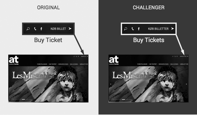
By merely changing “Buy Ticket” to “Buy Tickets” there was a phenomenal direct sales increase of 20% over as many days.
Even though barely noticeable, such a change had an almost subconscious effect on buyers.
People seldom want to buy one ticket and go to the theater alone, so the message that they can buy multiple tickets and attend the theater with friends send a more positive message.
The tester also pointed out that “tickets” infers you can buy tickets for several shows at the same time.
Key Takeaway: What subtle messages is the language you’ve chosen for your site sending to visitors? A few small tweaks can make a major difference in your results.
Moving Forward with Landing Pages
To be clear, I’m not blindly suggesting you follow the key takeaways I’ve identified from these test case studies.
Instead, use these examples to remind yourself that landing pages will never be an exact science. Their success is solely due to constant trial-and-error testing.
Your landing pages should be a continuously-evolving part of your content marketing strategy, and popular data should always be held up for scrutiny in your own trials.
Using your intuition about your customers’ specific behaviours might prove more effective than you realise.
Common sense often prevails over established practices; ideally, a blend of qualitative and quantitative analysis will allow your strategy to drive the biggest results.
Test, test and test again. You might find you get some very unexpected conversion increases from the most unlikely changes.
Has your business had any surprising results from its landing page testing? I’d love to hear about them in the comments below:
Header Image Source: VisualHunt.com
